January 25, 2012 2:36 pm
The Master Plan
Written by: Dana Bonello


In the next couple of years, this project endeavours to change the St Julian’s we current we currently know forever, transforming a previously neglected site into a Multi-functional commercial hub with a strong focus on financial services. We speak to Edward Bencini, the main architect behind this multifaceted development.
Our architectural and civil engineering firm was invited by a consortium of investors to assist them in the preparation of a bid for a Government tender for the sale of property at Pender Place and Mercury House in 2005. We visited the site and noted the opportunities and challenges of this important location at the heart of St Julian’s, Swieqi and Paceville, just off the Regional Road.
The development brief encouraged the architects to aim for the highest levels of design quality and innovative design concepts, allowing scope for the architects to mould the allowable building volumes into a master plan with buildings of varying heights enabling the release of open spaces at the ground levels.
Having been responsible for other major projects such as the Portomaso project, Sellum village, Cottonera regeneration project, Baypoint Radisson Hotel, and various others, we noted that this project presented new challenges.
The land comprised two sites, Pender Place and Mercury House, separated by the busy St Andrews Road.
Pender Place was an open parking place for 550 cars, bounded on 3 sides by residential buildings at the Gardens and St Julian’s, and on the fourth by St. Andrews Road. Mercury House site was abandoned, with the vandalised Mercury House and overgrown with weeds and shrubs. The site is surrounded on three sides by mainly commercial buildings and by St. Andrews Road. Together, these sites eventually acquired by Pender Ville Ltd, offered unique design challenges.
Clearly, the opportunity existed to design the project holistically, not as 2 separate projects. The sites and their uses could well be complementary. While Pender would ideally accommodate residential uses with some limited commercial uses on the St Andrews Road frontage, the Mercury site would be suitable for commercial, retail, leisure and office uses. The two sites together formed the gateway to St Julian’s and their uses would ideally be compatible to one another. The first concepts developed by our architects and landscape planners envisaged the visual connection of the 2 sites by a conceptual curve with a crescent at Pender and another at Mercury connected by a pedestrian bridge across St Andrews Road.
The Concept
The Pender crescent found its conceptual origin in the need to soften the proposed building volumes facing residences at the Gardens. This concept was developed further by the evolution of the idea to form an oval pedestrian piazza at the heart of Pender. In addition a buffer villa zone was created between the crescent and the gardens protecting the privacy of existing residences at the Gardens. At Mercury the main building would be a business tower forming the other virtual crescent on that site, with a screening building around the bland party wall with third parties. This master plan was approved by the Outline Development permit.
The Original Master Plan
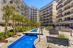
Following this approval, we proceeded with detailed design of Pender Phase 1, splitting the building mass into six detached blocks surrounding the 2000 s.q.m. landscaped pedestrian piazza. The blocks, each around 780s.q.m, were planned with one apartment occupying each corner quadrant, enabling all living rooms and bedrooms to be on the outside of the block, using the core of the block to accommodate the stairs and lifts and the apartment sanitary areas. This concept created a sense of space and freshness throughout the apartments which overlook the private landscaped piazza and the landscaped open spaces between the locks. The detailed design and co-ordination of phase 1 was carried out completely in house at our offices, and included inputs of our multi-disciplinary team working on the architecture, the structure, interior design, landscaping, lighting, as well coordination with other consultants. Latest architectural, 3-D, and structural software packages were employed throughout.
The elevational treatment uses façade enclosure walls, balconies, facade recesses, projecting fascias, and architectural hardware such as balcony railings – a variety of steel and glass railings, and the shade structures, in a simple but well detailed sculptural form renouncing the curvature of the crescent. Colours are subdued with white, shades of grey, glass and metal.
The gated piazza at phase 1 is a unique landscaped oasis at the heart of Pender, with serpentine water features and planted zones surrounding nests of stainless steel benches. The piazza provides residents with a tranquil, safe and relaxed setting, fully isolated from the hustle, bustle and noise of St Andrews Road. The piazza lighting mood varies with time, with different illumination settings until 9.00 pm suitable for reading at the seating nests, after that adequate for comfortable walking or jogging, and later suitable for security purposes.
Pender phases 2 and 3 will complete the east crescent to the piazza and form the St Andrews Road frontage. These phases include 4 detached blocks with 2 medium rise buildings which accommodate offices at the lower levels and residences in the upper floors, both with separate stairs and batteries of lifts. The lower floors are designed as the commercial podium on St Andrew’s Road with wide pavements meant to accommodate large pedestrian flows.
The Pender Hi-Rise
Phases 2 and 3 are designed to satisfy environmental and energy efficiency requirements, and façade treatment is accordingly provided with shading devices, recesses, thermal glazing, and other features.
Materials will be maintenance free and colours are generally similar to those of phase 1. The podium below the medium risers accommodates two floor high reception zones to the apartments and to the offices. Here the glass façade is set well back exposing and pronouncing the supporting columns.
Mercury House site across St Andrews Road from Pender is hugely important. This site is at the cross-roads of several major human activities and different uses, including the residents at existing zones around the sites, the 5 star hotels all within walking distance, the conference centres at these hotels, and the entertainment centre at Paceville. This site therefore has all the attributes to benefit from these surrounding uses, and to fill an important gap by delivering a world class financial and business centre, and to help stimulate the regeneration of the area.
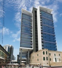
In 2009, Pender Ville Ltd made a strategic decision to market the site as a commercial and financial business centre, and following our development of a new concept for this site, the developers renamed the Mercury House site the “Exchange”, a name well suited to the former use of Mercury House as the international exchange in former years. FIMBANK plc soon after entered into an agreement with Pender Ville Ltd to acquire the north building at the Exchange. The developer’s brief required us to produce concepts and designs for a state of the art commercial and business centre at the Mercury site. The business centre was required to be a landmark tower building. It followed that we should include a succession of public pedestrian urban spaces between the proposed commercial buildings, the towers and the scheduled Mercury House building.
The new concept for the Exchange proposed to give Mercury House a far more pivotal role in the project by using it as the podium for the Exchange towers, with the north tower built within the large Mercury House courtyard, which will also become the reception area atrium of the financial centre tower. Of course we had to develop clear ideas on how to sensitively merge the new structures with the scheduled building, and how to construct the foundations and 5 basement floors of parking within and alongside Mercury House. These proposals were discussed in depth with the heritage authorities and approved by them.
Mercury House and The Exchange Towers
The towers and the surrounding lowlying commercial areas will together deliver an important new hub at the centre of St Julian’s and Paceville. The office floor space will accommodate hundreds of employees working above the large commercial zone at the lower levels, providing a captive market to the restaurants and shops. Passing trade of thousands of persons flowing weekly past the site will further complement business at these commercial premises.
The office towers will be a state of the art building used by corporate and financial companies. On site parking will be provided in 5 underground levels, with lift access to the reception atrium which will provide secure and controlled access to the towers.
The tower office floors are completely flexible with all services provided in strategic locations at the core to enable subdivision of the floor space into a variety of alternative layouts for 1 or several independent offices. The towers provide particular challenges in their own right with issues such as the façade elements, or co-ordination of services and service duct risers, and other design issues, being vital considerations. One particular issue relates to wind generated impacts, both to the tower structure itself, as well as wind impacts generated at pedestrian level. This was fully addressed and we coordinated studies with an overseas firm of specialist wind consultants. The idea to place the tower within the Mercury House footprint released much of The Exchange site for use as public pedestrianised piazzas.
We have created a succession of public spaces between the surrounding streets, achieving a wide level of pedestrian permeability throughout the site, which was a primary objective. The large piazza off St Georges Road will allow a full appreciation of the restored Mercury House, which now proudly stands out as the podium of the Exchange Financial Centre.
The Exchange Piazza
This large piazza, whilst creating an extension of St Georges Road, provides a powerful visual connection to St Andrews Roadwhich is 1 floor above St Georges Road. The void below the south wing of the Exchange tower, elevated on three floor high columns, provides the visual axis connecting the Mercury House piazza with another large piazza at the level of St Andrews Road. The architecture at the Exchange is designed differently, but compatible to that of Pender. The FIMBank building and the Exchange towers reflect a corporate quality.
The clean lines of the towers with the double or triple floor bands of glazing and the sharp edges facing Pender, and the white clad vertical wall elements folding over at the roof into the top capping, together with the vertical mass of the black terracotta cladding of the core rising between the towers, articulate the façade of this landmark building, boldly defining its corporate soul. The low lying retail and commercial buildings at the street levels have been designed visually very light, as though covered extensions of the piazzas, merging into the atrium behind Mercury House. The landscaping at the Exchange is carefully related to the buildings and to the forms of the piazzas.
The paving pattern at St Andrews Road piazza transposes the road curvature into the diagonal belvedere overlooking the lower piazza. The light poles in the piazzas are co-ordinated into the paving patterns. Our first draft master plan addressed the problem created by the ‘bus terminus’ at St. Andrew’s Road, making this road far more pedestrian friendly. In the final approved proposals, the bus terminus has been replaced by well designed bus stops on either side of the road. The road will be widened from the existing two lanes to four, and a large new roundabout will regulate all traffic passing along St Andrews road.
Source:
http://www.maltaeconomicupdate.com/flips/jan2012/
Categorised in: News & Press Releases


